
Design System Case Study
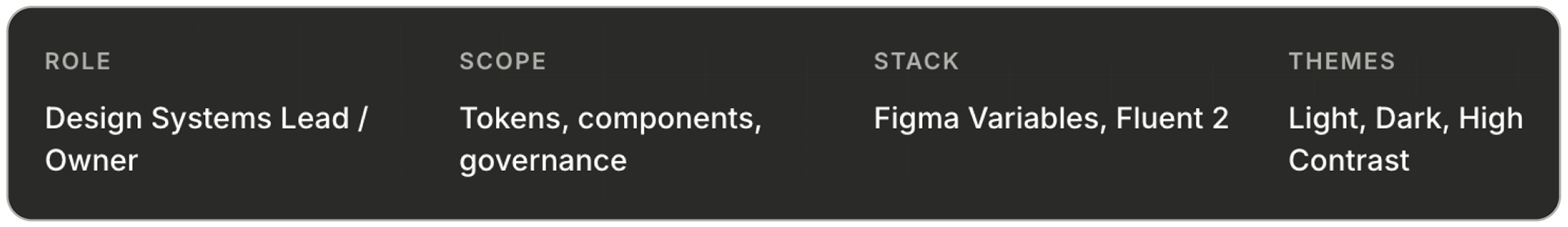
Design System | 2024 | Product Design Lead
Design System | 2024 | Product Design Lead
A unified, fully themeable Fluent-based design language that replaced a fragmented tool suite's component sprawl — cutting design debt, unlocking dark mode and accessibility, and giving engineering a single source of truth.
Overview
A productivity tools suite with no shared language
A productivity tools suite with no shared language
DS-Tools is the internal design system library powering a multi-product productivity tools suite. When I took ownership of it, the suite had grown into half a dozen products that all looked related but shared no real foundation. Buttons had eleven variants across three products. Dark mode shipped in two. Typography drifted between Inter, system, and Segoe. Teams copied hex values out of old mockups. Every new feature meant rebuilding primitives that should already have existed.
I led the effort to replace that sprawl with a single governed library — a Fluent 2-based token architecture with a custom brand, a semantic layer, and component parity across light, dark, and forced-colors themes. The library is now the default starting point for every new screen in the suite.
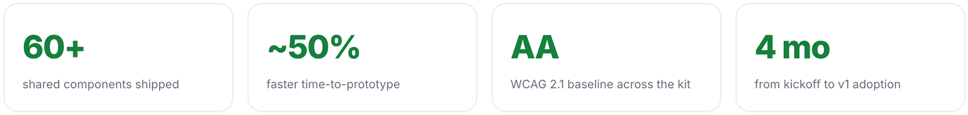
Impact — industry benchmarks
What a mature design system typically returns
What a mature design system typically returns
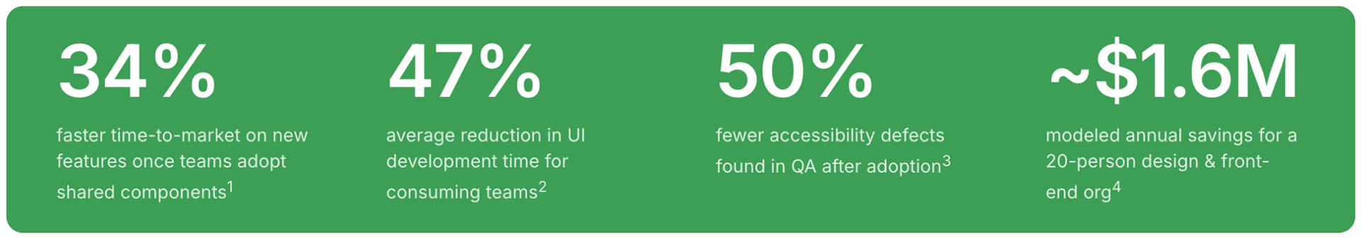
1 Forrester TEI study of a mature enterprise design system, 2021.
2 Sparkbox Design Systems Survey, 2022 — median reported dev time savings on component work.
3 Deque & WebAIM pattern-library studies; accessible-by-default components shift defects left.
4 Illustrative model: 20 people × 15% of time reclaimed × $135/hr fully loaded × 52 weeks ≈ $1.6M.
Your mileage will vary — numbers shown are industry benchmarks, not a specific claim for this project.
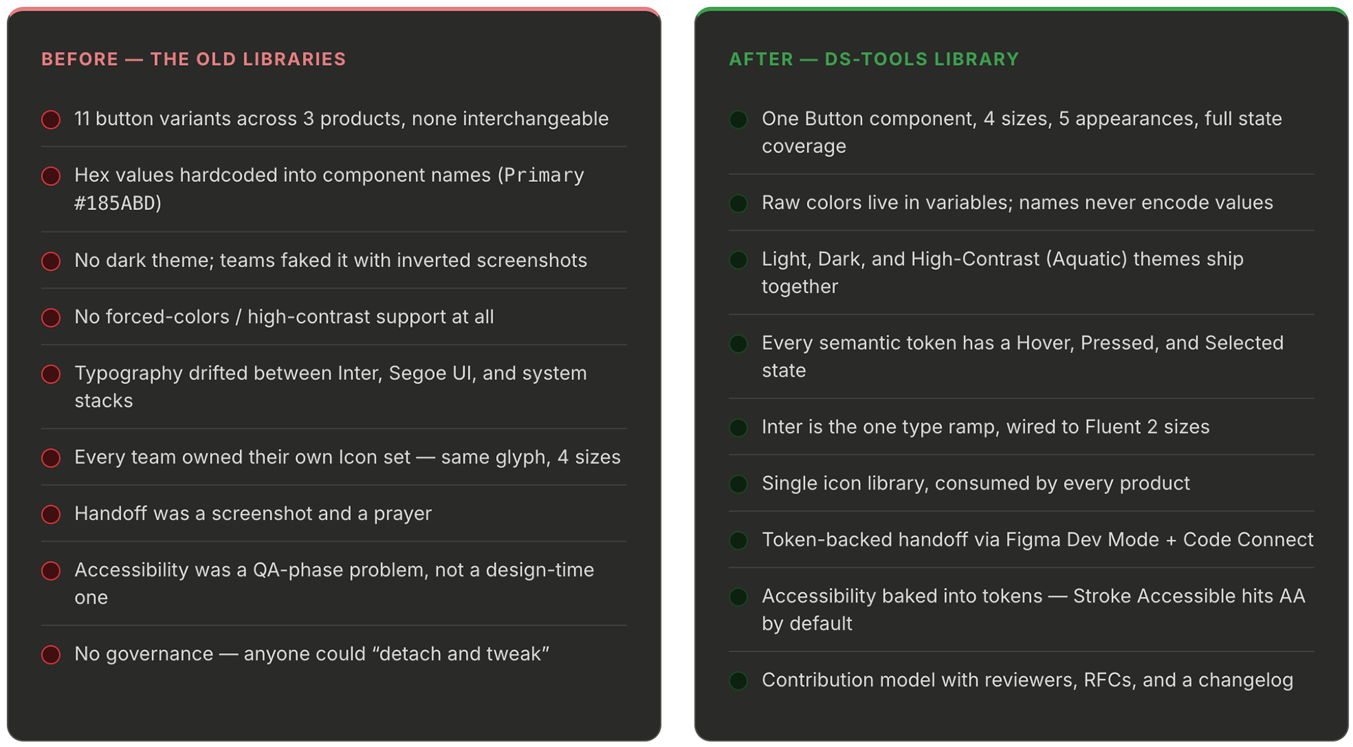
The Challenge
The old system wasn't a system — it was a shared folder
The old system wasn't a system — it was a shared folder
Before DS-Tools, each product team maintained its own Figma library. On paper there was a "brand." In practice, the brand existed as a hex value pasted into a Slack message two years earlier. I spent my first month auditing the existing libraries and the pain points were consistent across every product team:
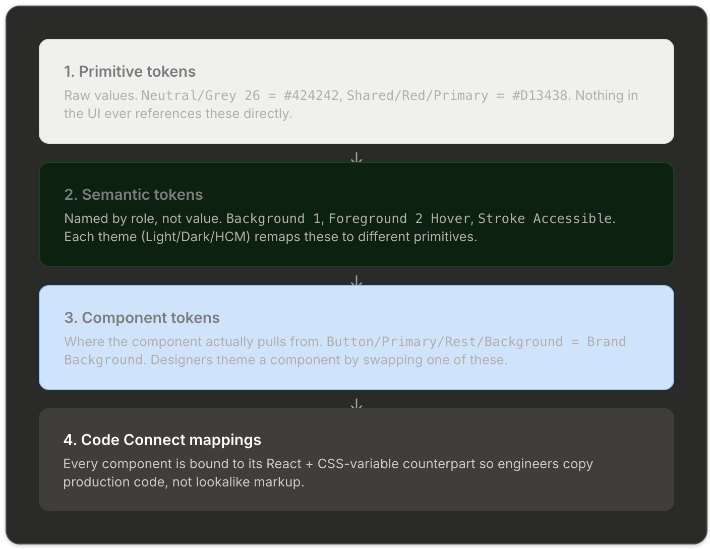
Architecture
Four layers, one contract
Four layers, one contract
The whole library is built on a four-layer token model. Every color, space, radius, and type style a designer touches resolves down through these layers to exactly one primitive. That's the rule that makes the system governable: rename the primitive in one place and the entire suite rethemes itself.
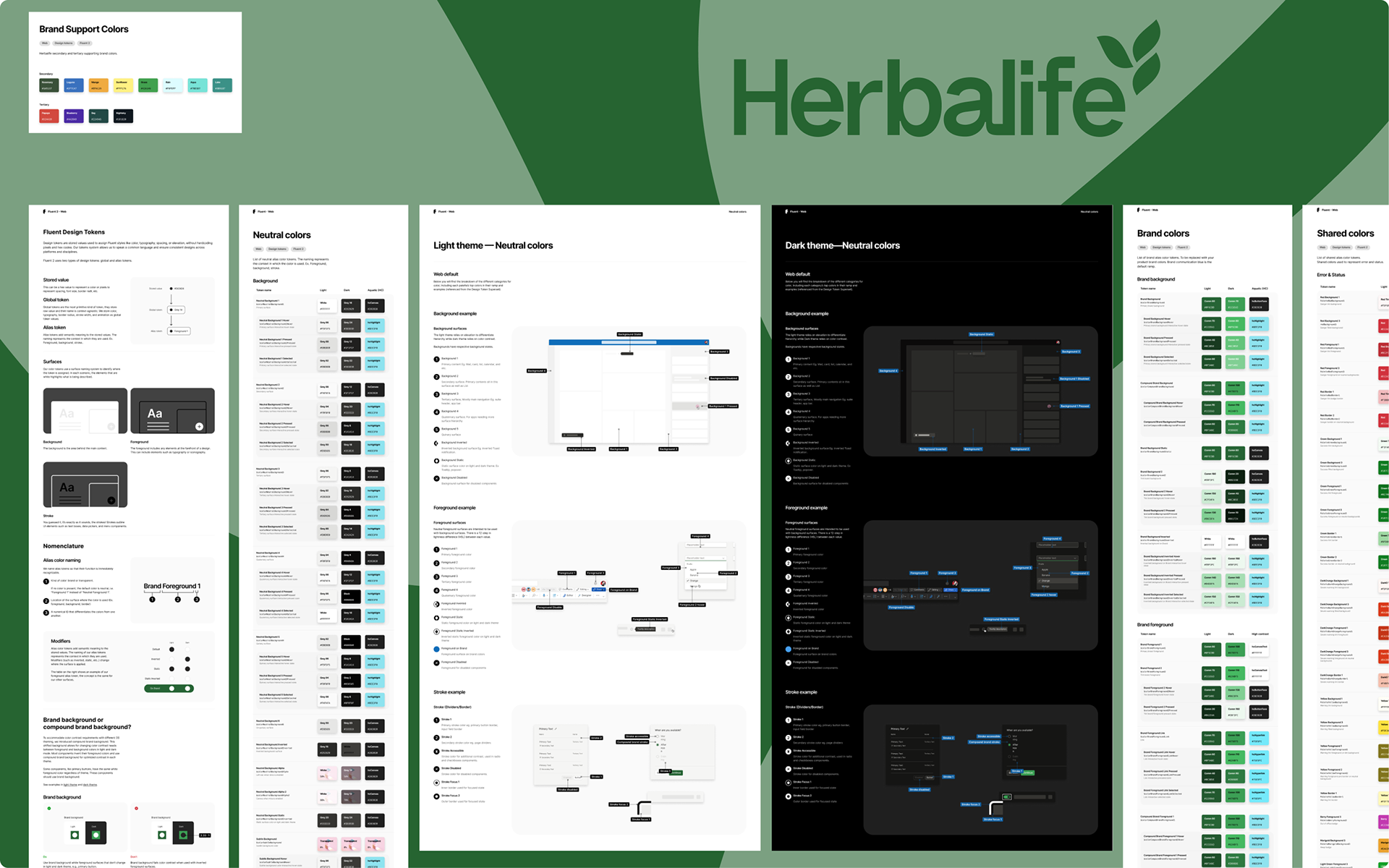
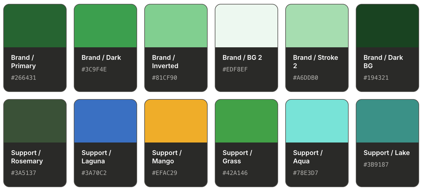
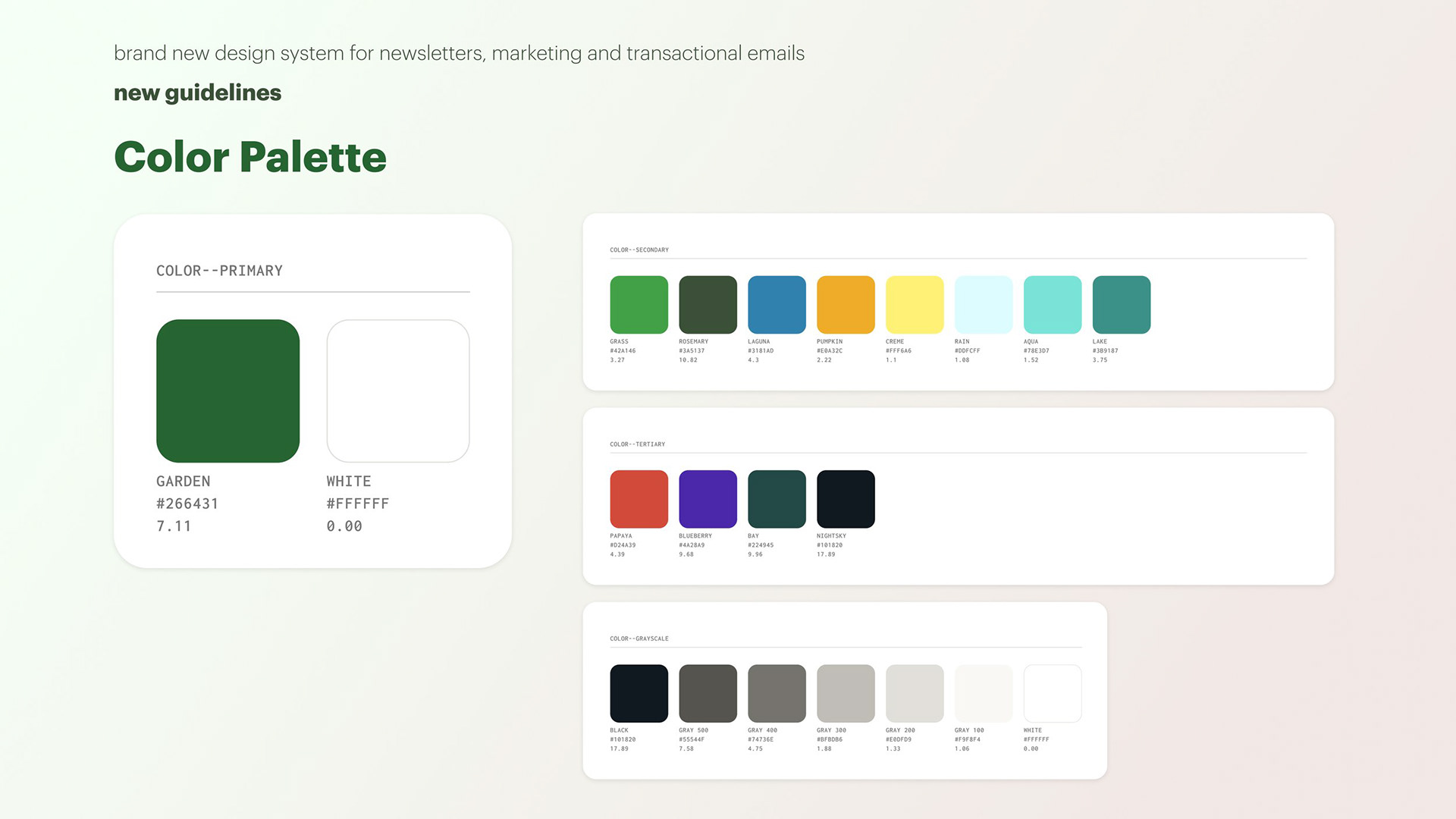
Brand & support palette
The suite's brand is a deep green (#266431 light, #3C9F4E dark) with a custom "Starcourt" support palette layered on top for product accents, data visualization, and illustration. The support palette is split into Secondary (always safe for UI) and Tertiary (reserved for marketing and illustration).
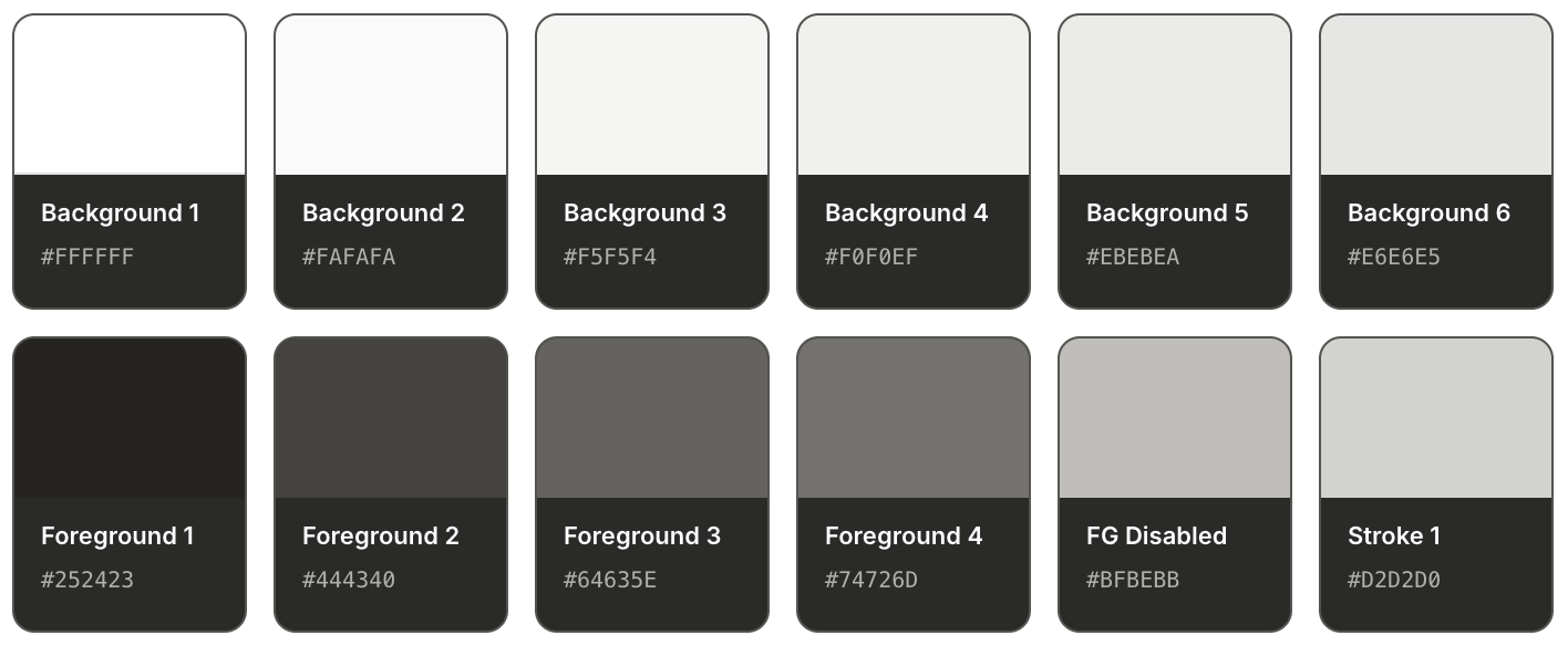
Semantic neutrals across themes
The neutral layer is where the real work happens. Background 1 through 6 give designers a choice of depth without ever picking a hex; each level knows its own Hover, Pressed, and Selected state, and each theme automatically remaps. This is the part of the old system that was most broken — and the part that unlocked the most velocity once fixed.
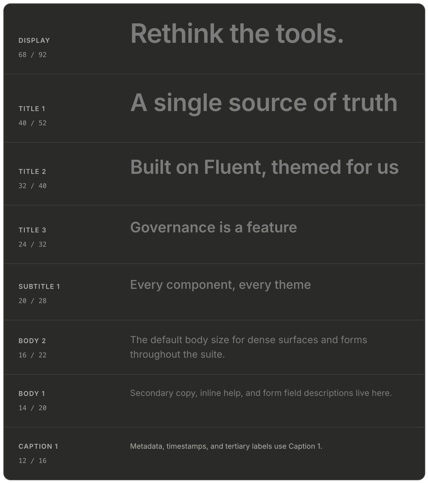
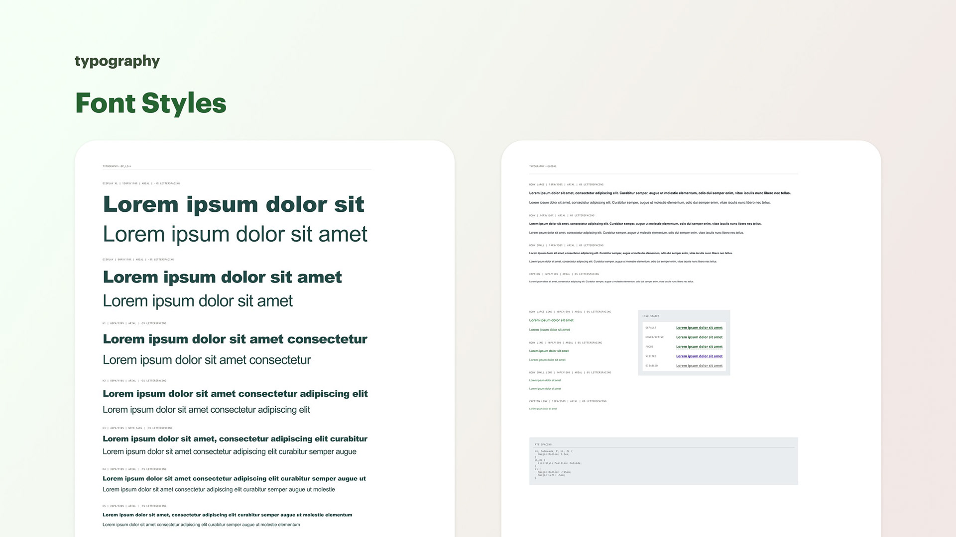
Typography — one ramp, ten steps
Typography was collapsed onto a single Inter ramp wired to the Fluent 2 web scale. Ten steps from Caption 2 to Display, each with tuned line heights. The old libraries had 23 text styles; the new one has 16 — and every one of them is referenced by a semantic role, not a pixel size.
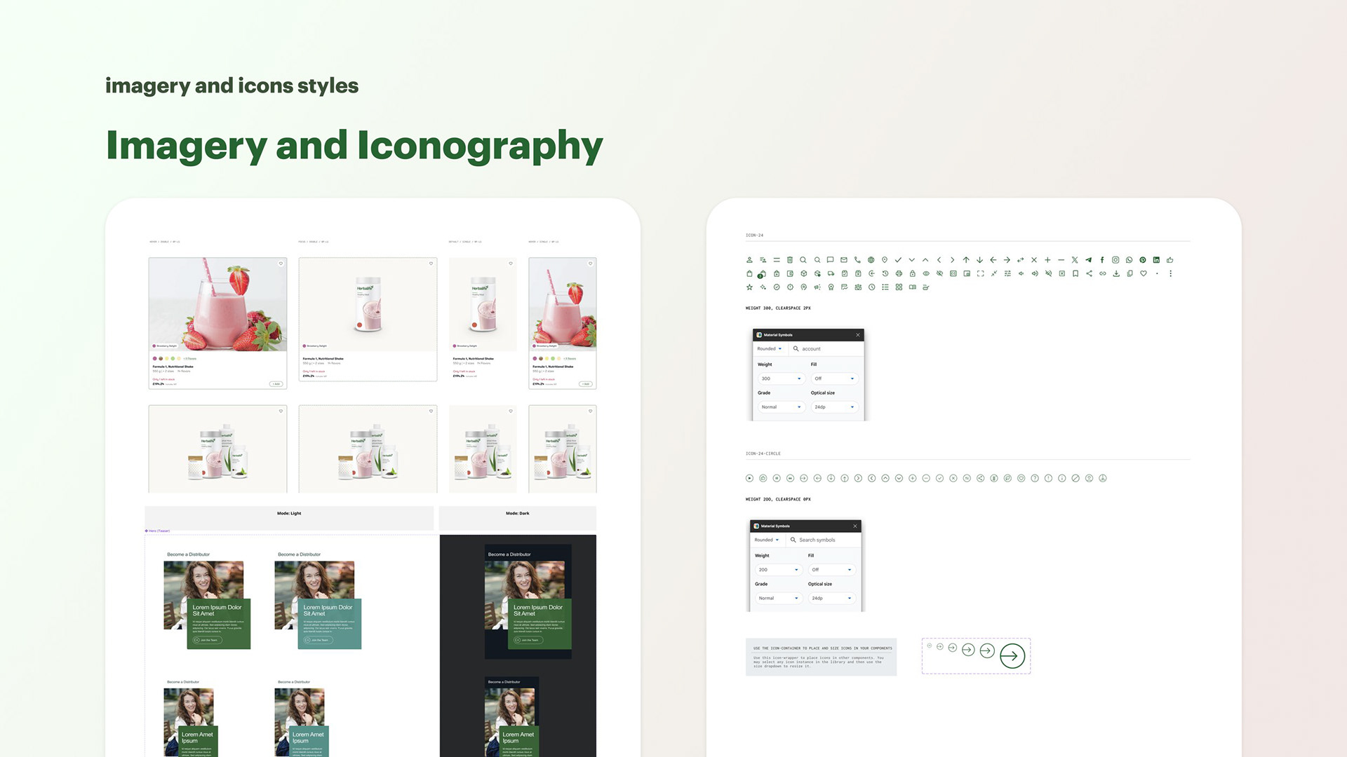
Component gallery
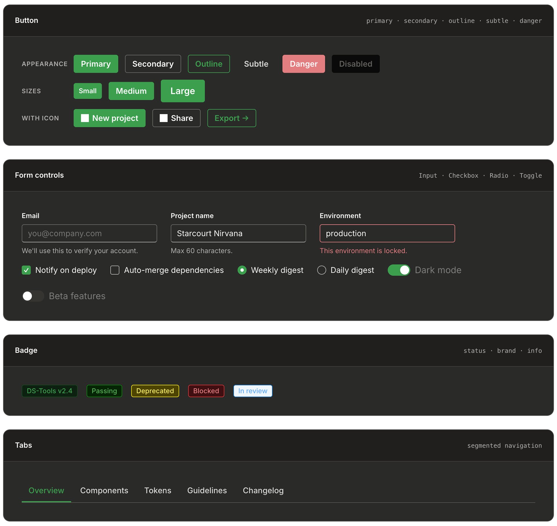
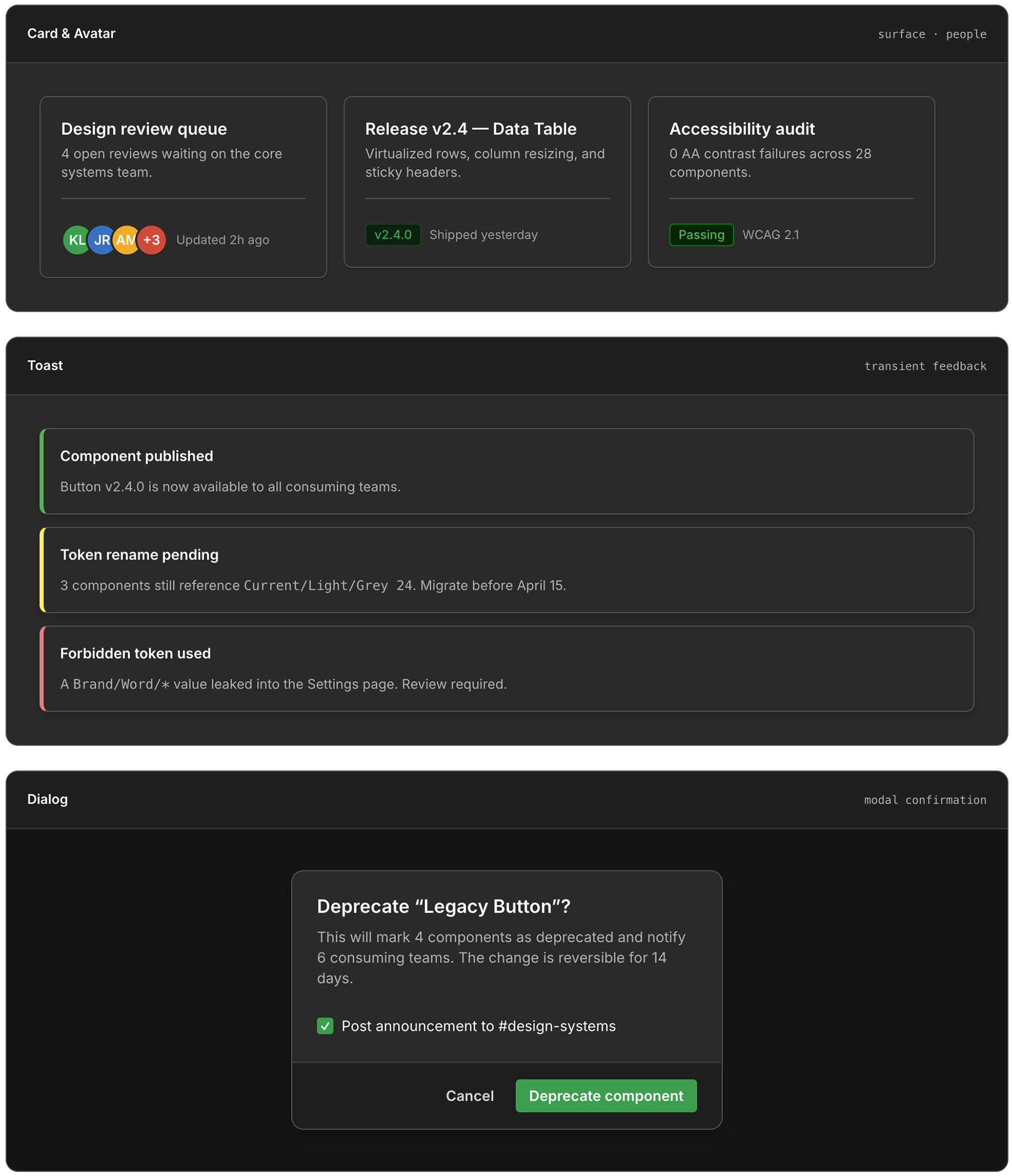
A sample of the 28 core components
Every component below is rendered live using the exact DS-Tools tokens — same hex values, same type ramp, same border radii, same elevation recipes. If you change a token in the library, everything on this page would rethemed with it.
Templates
Composed templates, same tokens
Composed templates, same tokens
Templates are where a design system proves its worth. Both of the screens below are composed entirely of the components above — nothing custom, no detached instances, no hardcoded values. A designer drops in a template, swaps the data, and ships.
Process
Six months, four phases, one library
Six months, four phases, one library
I ran the project as a phased rollout instead of a big-bang relaunch. Big-bang reskins are how design systems die: adoption stalls, product teams resent the forced migration, and the library becomes a museum. Instead, each phase shipped something consumable on its own.
Phase 1 — Audit & inventory (weeks 1-4)
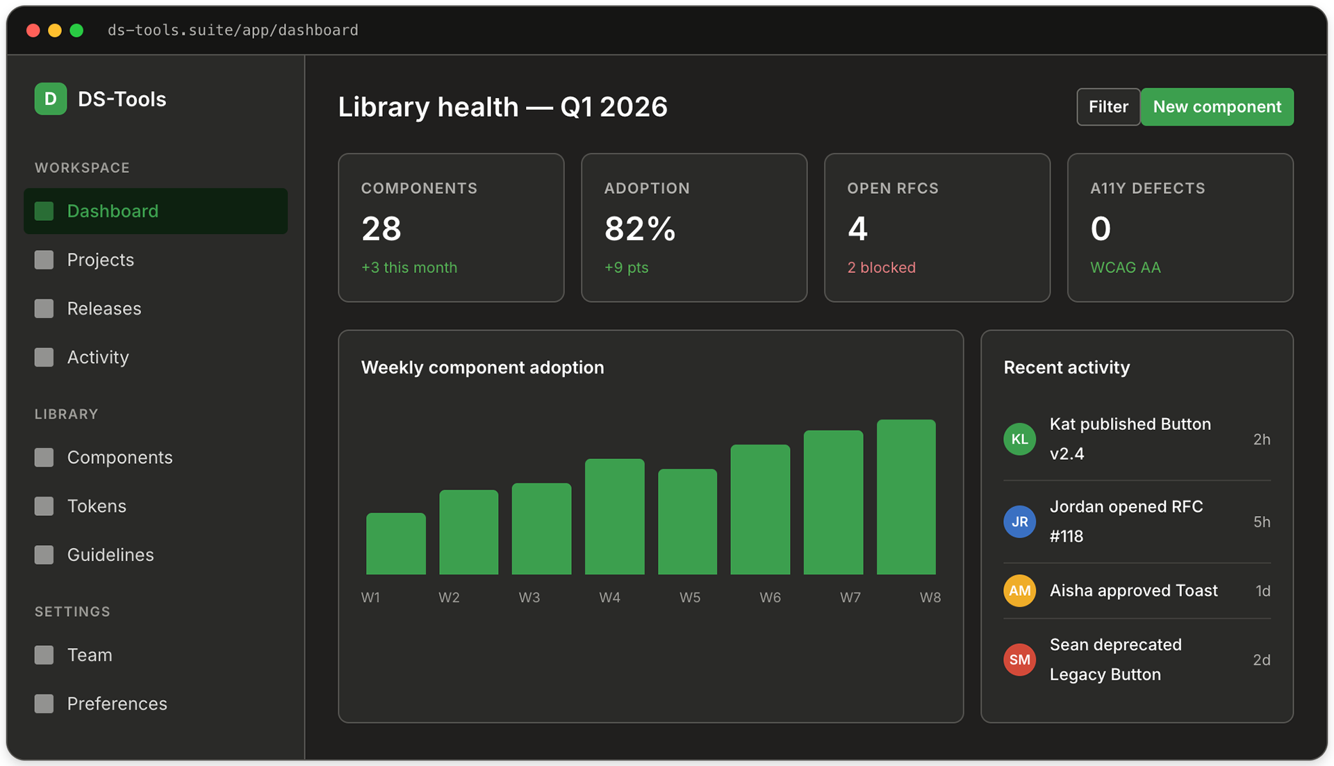
I catalogued every component across every product library: 340+ components, 23 type styles, 11 button variants, 7 overlapping color palettes. The audit became the business case for the project.
Phase 2 — Token foundation (weeks 5-10)
Built the four-layer token architecture in Figma Variables. Established the Light and Dark themes first, then retrofitted the brand green over a Fluent 2 base. Shipped tokens-only to early-adopter teams for validation before any components existed.
Phase 3 — Core components (weeks 11-20)
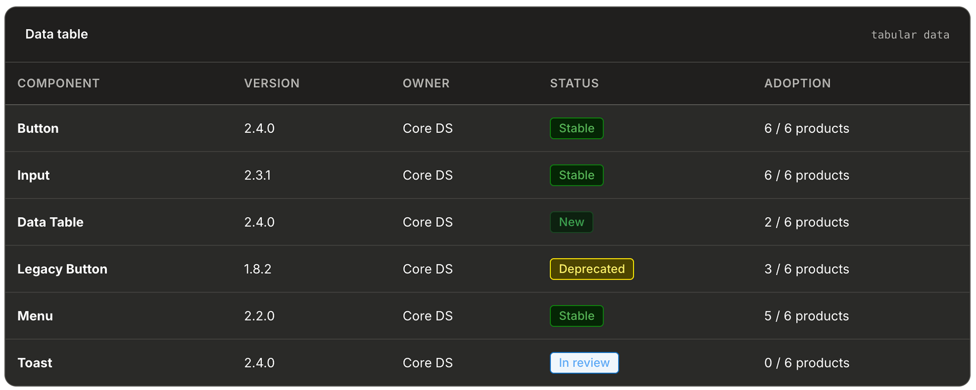
Built the 28 components that covered 80% of real screens: Button, Input, Select, Checkbox, Radio, Toggle, Tabs, Tooltip, Dialog, Menu, Toast, Card, Avatar, Badge, Divider, Progress, Spinner, Table, and the navigation shell. Every one shipped with Code Connect mappings to production React.
Phase 4 — Adoption & governance (weeks 21-26)
Set up the contribution model: RFC template, design review rota, versioned changelog, deprecation policy, and a quarterly office-hour for consuming teams. Migration was opt-in per screen, not per product — teams could move at their own pace but new screens had to use DS-Tools.
Hard problems
The tricky parts nobody warns you about
The tricky parts nobody warns you about
The migration surfaced challenges that were less about design and more about discipline and governance. Midway through, multiple overlapping token namespaces created confusion across teams, which I resolved by enforcing a 48-hour library freeze, programmatically standardizing references, and relaunching a single canonical system—an unpopular move in the moment, but one that paid off in long-term stability.
We also uncovered inherited cross-brand tokens from the Fluent base that had quietly leaked into production, prompting me to implement a Figma linter and formalize validation within the design review process.
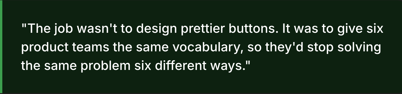
Accessibility presented a different kind of constraint: rather than overextending, I intentionally scoped high-contrast mode to a transparent, partially complete solution aligned with system semantics, prioritizing integrity over the illusion of completeness. Ultimately, the most complex challenge was governance—aligning six product teams on shared ownership—which I addressed through a federated contribution model that emphasizes structured RFCs, mandatory reviews, and documented changes, ensuring the system evolves deliberately rather than drifting back into inconsistency.
"The new design system transformed how we communicate with our global audience. What used to take days now takes hours, and the results speak for themselves."
-- Danny Guerrero, Marketing Product Owner
-- Danny Guerrero, Marketing Product Owner
Business outcome
Why the finance team cared
Why the finance team cared
The business case for DS-Tools wasn’t framed around consistency—it was grounded in measurable cost savings across engineering, design, and accessibility. Mature design systems have been shown to reduce UI development time by up to 50%, which, at our scale, translates into weeks of reclaimed engineering capacity each release—time that can be reinvested into delivering features instead of rebuilding components. On the design side, eliminating redundant work drove significant efficiency gains, with teams previously spending up to a quarter of their time recreating existing solutions due to lack of visibility. Accessibility further strengthened the case, as embedding compliant tokens and tested color pairings directly into core components prevented costly downstream remediation, where issues are exponentially more expensive to fix in production. Taken together, these efficiencies reposition DS-Tools from a design initiative to a strategic business investment—one that unlocks roughly $1.6M in annual capacity across a 20-person team, while also accelerating time-to-market and reducing risk.


Reflection
What I'd do differently
Ship tokens before components
The single best decision I made was releasing the token layer on its own, a full month before any component shipped. Teams started theming their own local components against the new variables immediately, which meant the eventual component migration was mostly a find-and-replace. If I did this again I'd go even further and ship tokens alone for two months.
Build the contribution model on day one
I let the RFC process lag into Phase 4 and it showed — Phases 2 and 3 accumulated a dozen decisions that had to be retroactively documented. Governance is not overhead; it is the system.
Treat the library like a product
DS-Tools has a roadmap, a changelog, a release cadence, office hours, and a Slack channel where consumers can file issues. Treating it like an internal product rather than a folder of assets is the thing that kept it alive past the initial enthusiasm.
The version of DS-Tools we shipped is not finished — no design system ever is. Forced-colors mode needs to be completed, the icon library needs another pass, and component-level tokens need to land for Data Table. But the foundation is governed, the adoption curve is moving in the right direction, and the suite finally has a shared language. That's the win I was hired for.