

Bizworks Plus App (REDESIGN)
Herbalife BizWorks App Redesign
Redesigning a mission-critical distributor management app for 1.78M global users across 94 countries — while establishing a new design system and future vision.
Redesigning a mission-critical distributor management app for 1.78M global users across 94 countries — while establishing a new design system and future vision.

Context
A high-stakes tool for millions of distributors
A high-stakes tool for millions of distributors
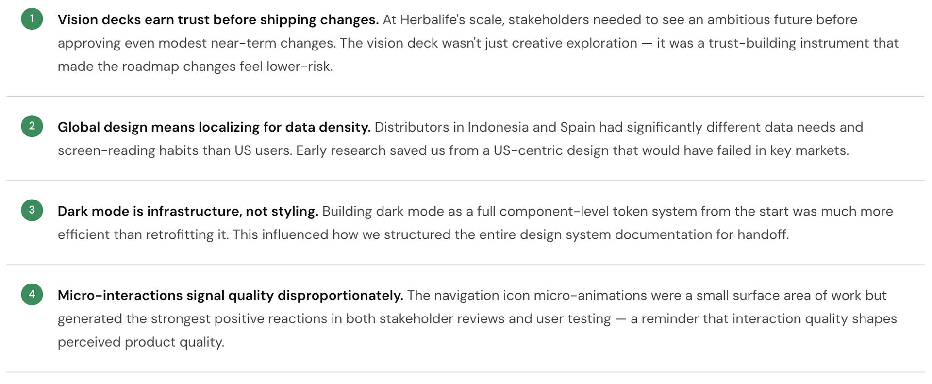
BizWorks is a paid mobile app enabling Herbalife's global distributor network to manage their entire business — tracking sales volume, monitoring downlines, hitting Marketing Plan milestones, and communicating with their teams. For many distributors, this app is their business dashboard.
When the company initiated a global rebrand and launched a new Design System (DS Tools), BizWorks presented an opportunity to go beyond a cosmetic update. The internal UX team proposed a comprehensive "vision deck" — an exploratory redesign that would push the boundaries of what the app could become.
I led the UX and interaction design throughout this engagement, from initial audits through vision concept creation, stakeholder presentations, and final handoff to engineering.
The Problem
An app that felt like it was built for another era
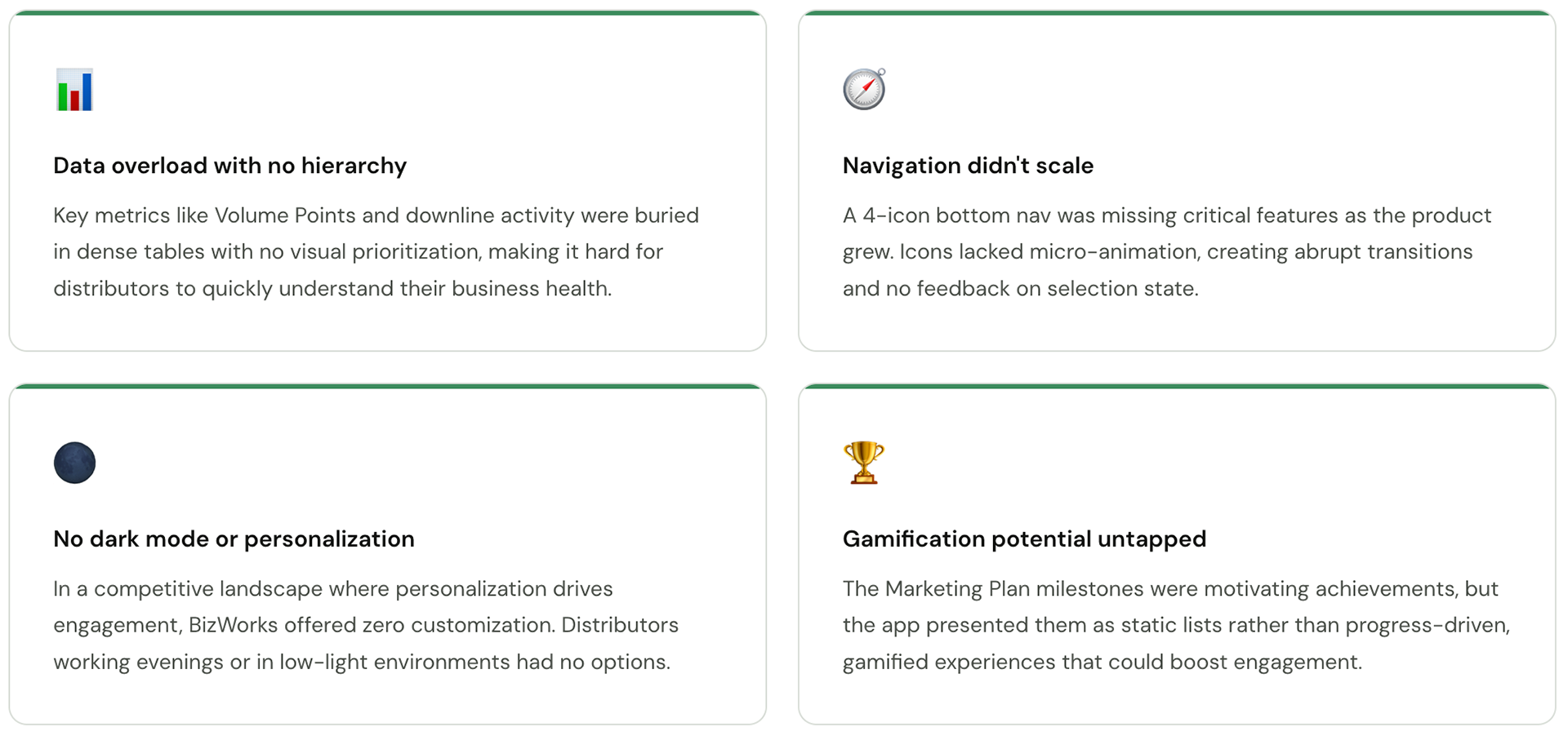
BizWorks had accumulated years of feature additions without a coherent design direction. Distributors were struggling with data-heavy screens that were hard to scan, navigation that didn't scale to a growing feature set, and an interface that lacked the visual quality expected of a premium paid product.
Research
Understanding how distributors actually work
Understanding how distributors actually work
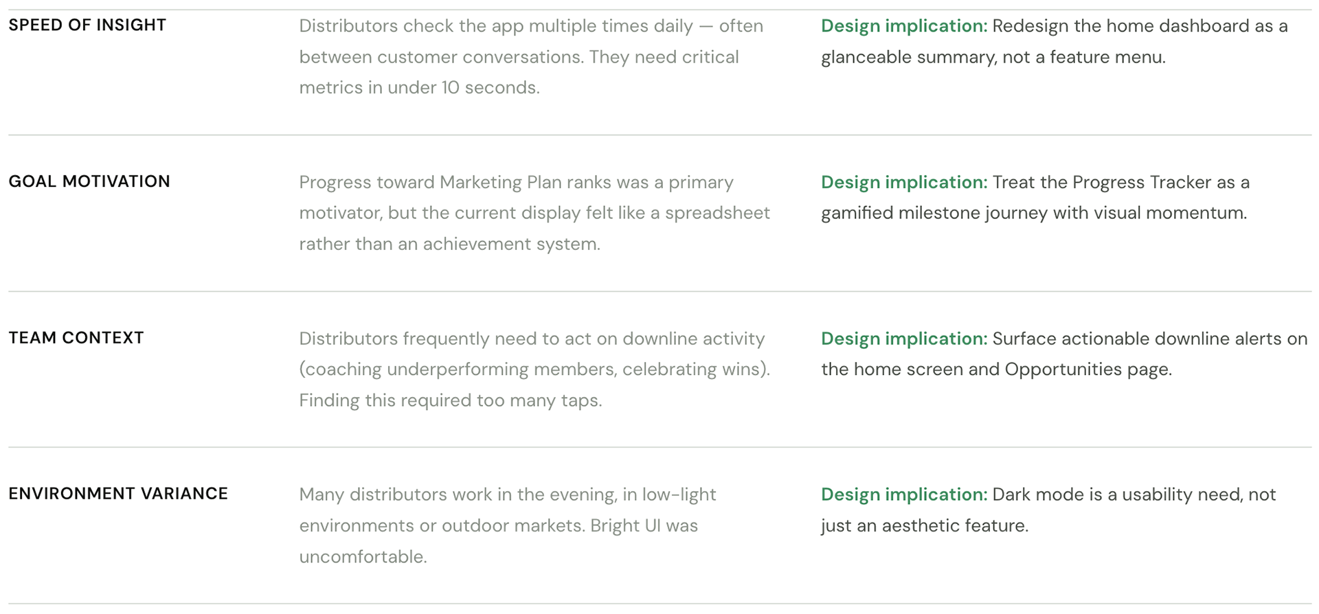
Before designing anything, we ran a mixed-methods research sprint to understand distributor workflows, pain points, and the mental models they brought to the app.
What we did
User Interviews (n=18)
Semi-structured interviews with distributors across 4 markets — US, Mexico, Indonesia, and Spain — covering daily workflow, key decisions, and frustrations.
Semi-structured interviews with distributors across 4 markets — US, Mexico, Indonesia, and Spain — covering daily workflow, key decisions, and frustrations.
App Analytics Audit
Reviewed session data, drop-off points, and feature usage frequency to understand where users were spending time and where they were leaving.
Reviewed session data, drop-off points, and feature usage frequency to understand where users were spending time and where they were leaving.
Comparative Analysis
Audited 6 competitor apps and 3 adjacent MLM/direct sales tools to identify industry patterns and opportunities for differentiation.
Audited 6 competitor apps and 3 adjacent MLM/direct sales tools to identify industry patterns and opportunities for differentiation.
Usability Testing - Existing App (n=12)
Task-based usability sessions with the existing app to establish a baseline for navigation efficiency, comprehension, and error rates.
Task-based usability sessions with the existing app to establish a baseline for navigation efficiency, comprehension, and error rates.
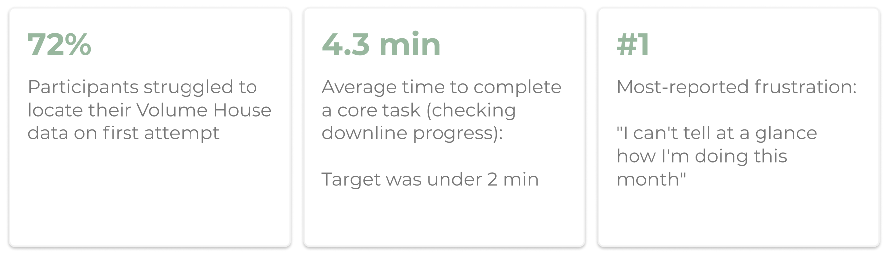
Key numbers
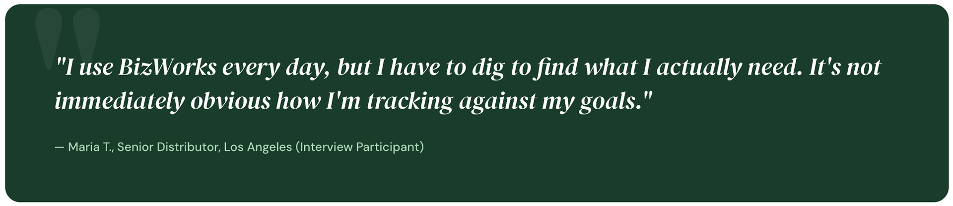
What we heard (synthesis themes)
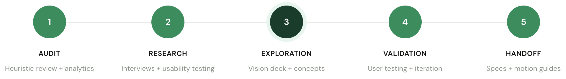
Design Process
From audit to vision deck
From audit to vision deck
Given the scale and sensitivity of the platform, we structured our work in phases — moving from audit and principles, through explorations, to a validated vision deck that could inform the live roadmap.
Key design decisions
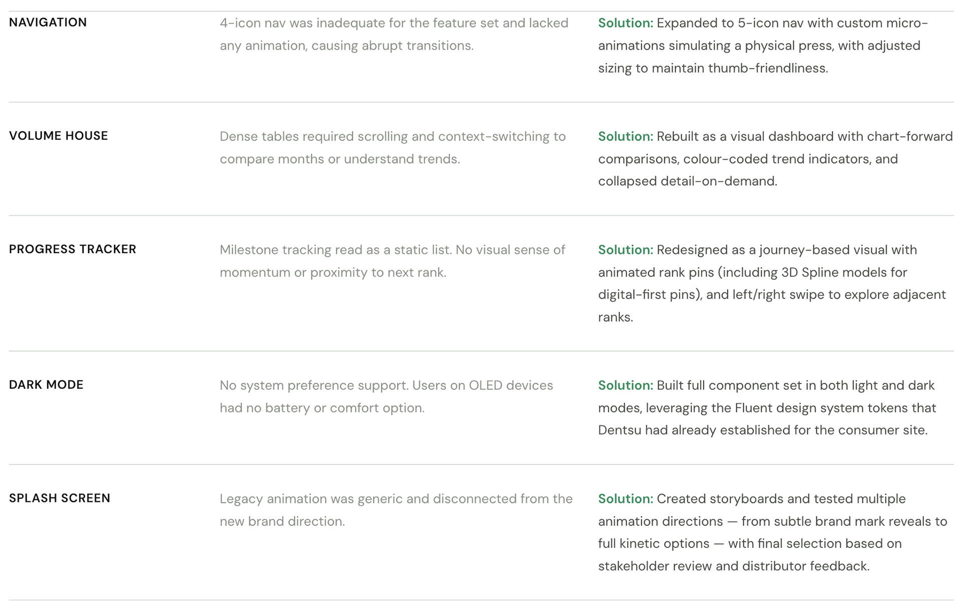
Dark Mode Option
During the development of the consumer site, Denstu designed a "dark mode" which was also supported in Fluent which was leveraged to build components.
Splash Screen Storyboards
The Splash screen was an opportunity to modernize the initial user experience and integrate new branding so I created rough storyboards for the designer to explore animations.
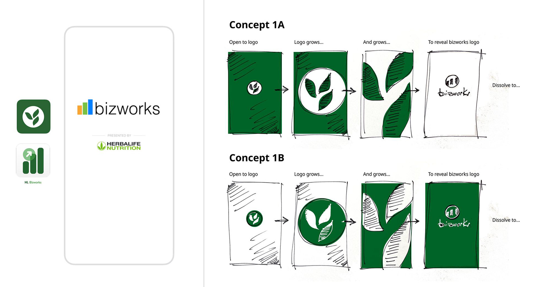
Splash Screen Animations
We came up with multiple options to take through reviews. The first few were variants of the legacy animation with the rest inspired by current App trends. Click play to view.
Design Explorations
The navigation menu icons lacked micro-animation, resulting in abrupt changes upon user interaction. The newly designed navigation icons incorporate subtle micro-animation, simulating the act of pressing a button.
Additionally, we implemented minor sizing adjustments to accommodate the five icons menu, replacing the previous four icons.
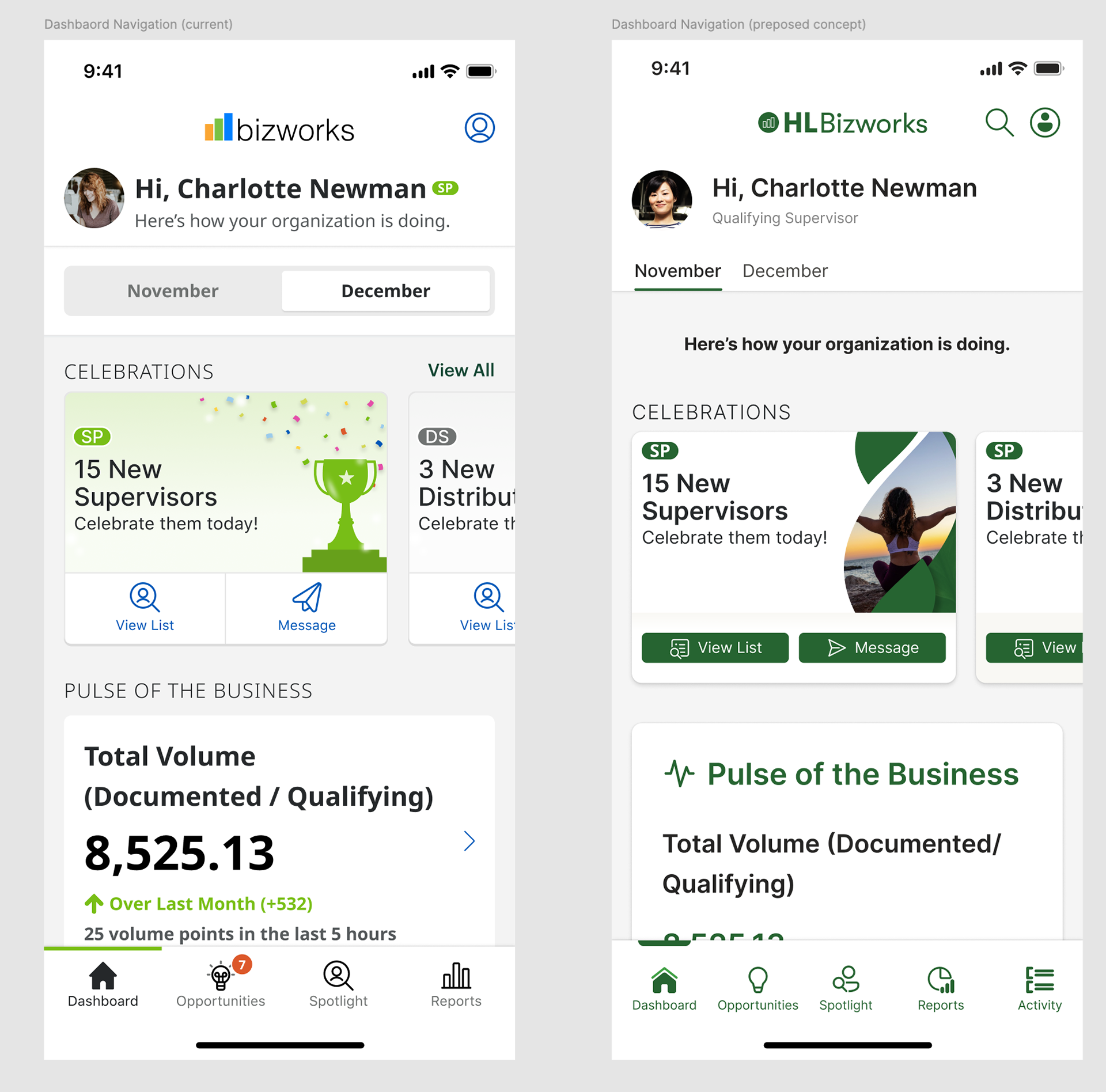
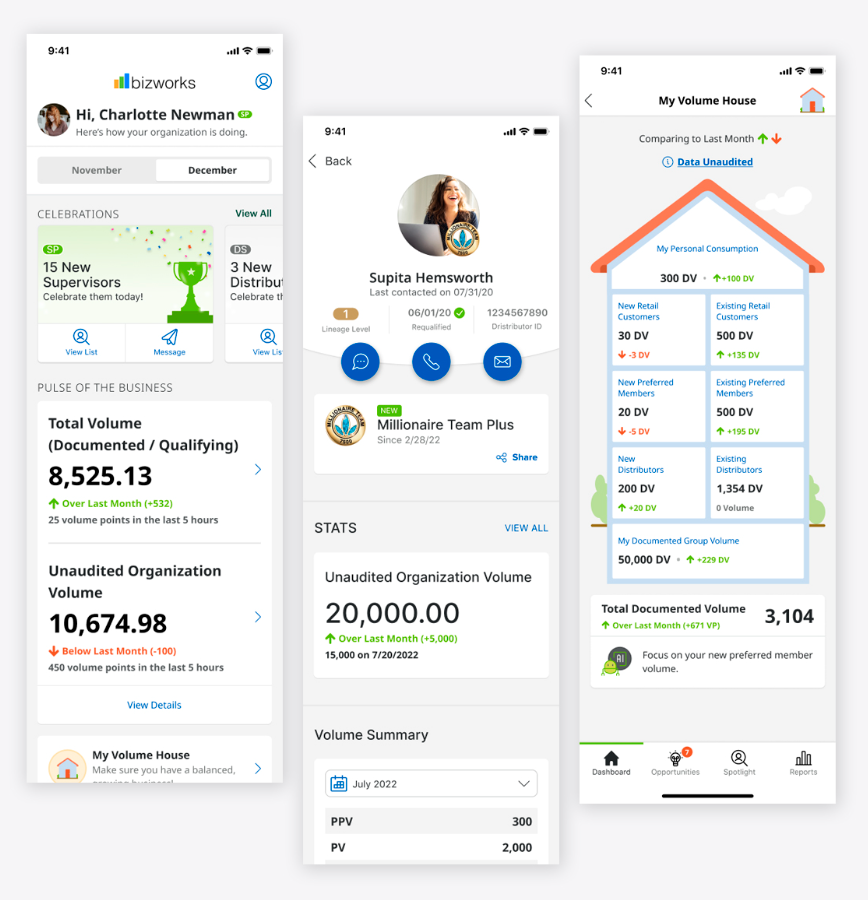
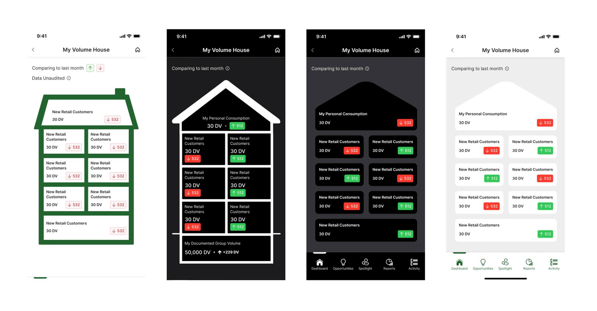
Volume House & Opportunities Pages
Volume House allows Distributors to view data sets comparing months, new customers, volume points, etc. Opportunities gives visibility into downline business activity and performance.
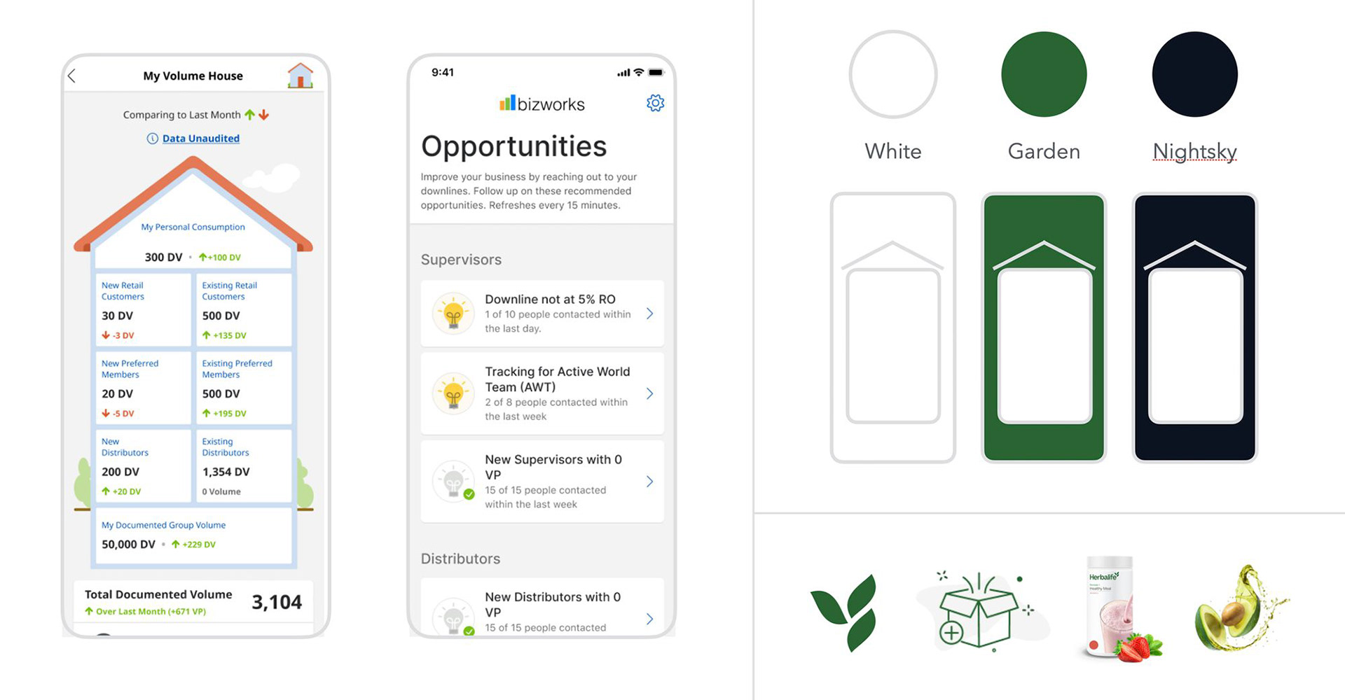
Volume House Explorations
Explorations for new Volume House interfaces looked at light and dark mode options, a more modern approach, and more emphasis on interaction.
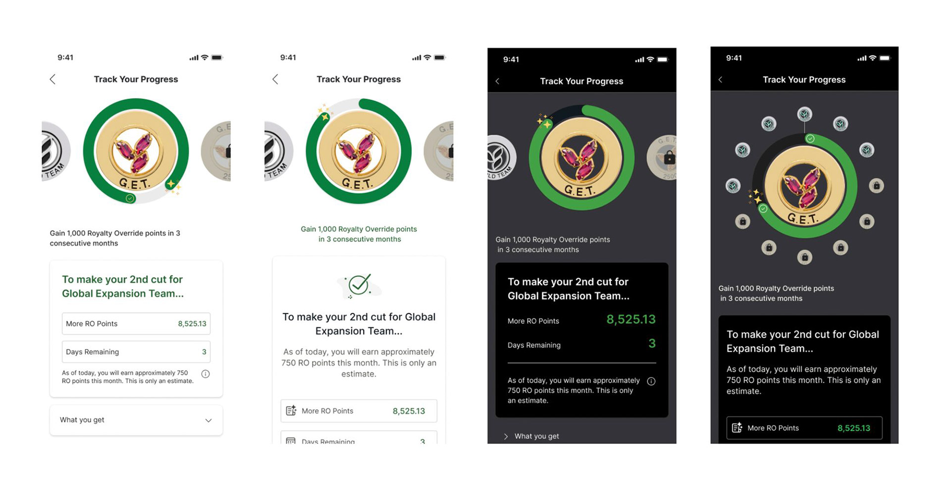
Progress Tracker
Progress Tracker allows Distributors to view where they are on the Marketing Plan. This tool allows them to track their progress, volume points and future goals. I had the team explore various modes, new functionality, and 3D Pin options.

Progress Tracker Explorations
Explorations with the new component set on white as well as dark mode. Also explored alternative left/right swipe and alternate functionality.
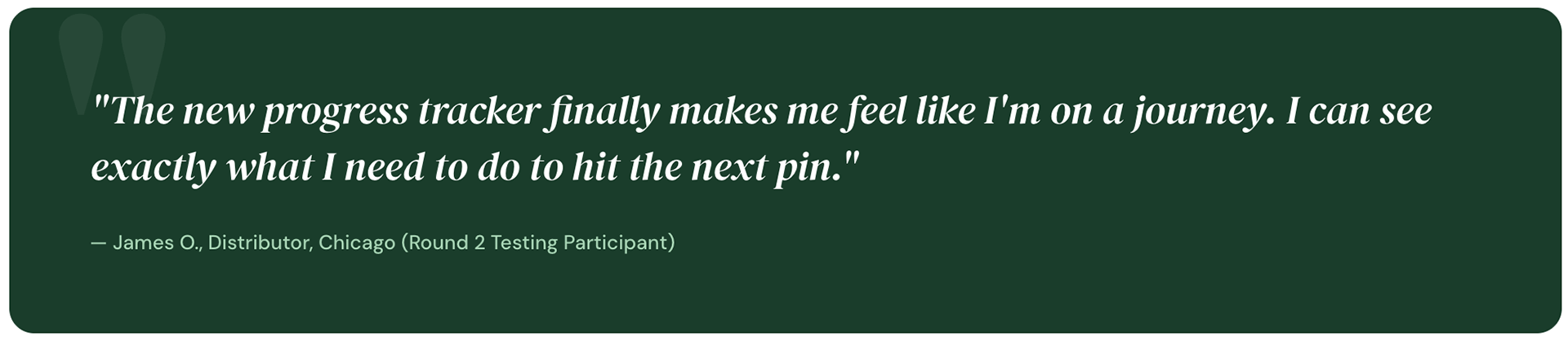
Testing our assumptions with real distributors
Once the vision deck was at mid-fidelity, we ran two rounds of usability testing to validate core flows before full-fidelity handoff.
Round 1 — Concept testing
Tested the new home dashboard and Volume House redesign with
8 participants using clickable Figma prototypes. Key tasks: check this month's volume, identify top performing downline member, navigate to Progress Tracker.
8 participants using clickable Figma prototypes. Key tasks: check this month's volume, identify top performing downline member, navigate to Progress Tracker.
Findings:
61% task success rate on home dashboard — a significant improvement over baseline but with clear room to grow. Primary issue: CTA label for Opportunities was unclear — revised from "View Downline" to "My Team Activity".
61% task success rate on home dashboard — a significant improvement over baseline but with clear room to grow. Primary issue: CTA label for Opportunities was unclear — revised from "View Downline" to "My Team Activity".
Round 2 — Comparative testing
Side-by-side sessions comparing the old and new navigation with
10 participants. Measured time-on-task and satisfaction (SUS score).
10 participants. Measured time-on-task and satisfaction (SUS score).
Findings:
Mean task completion time dropped from 4.3 minutes to 1.8 minutes. SUS score improved from 52 to 81 — crossing the "Good" threshold for the first time. Dark mode was rated "highly preferred" by 74% of participants who worked evenings.
Mean task completion time dropped from 4.3 minutes to 1.8 minutes. SUS score improved from 52 to 81 — crossing the "Good" threshold for the first time. Dark mode was rated "highly preferred" by 74% of participants who worked evenings.
Outcomes
What shipped and what changed
What shipped and what changed
The vision deck was approved by stakeholders and phased into the engineering roadmap. Several features from the explorations shipped within the following two release cycles.
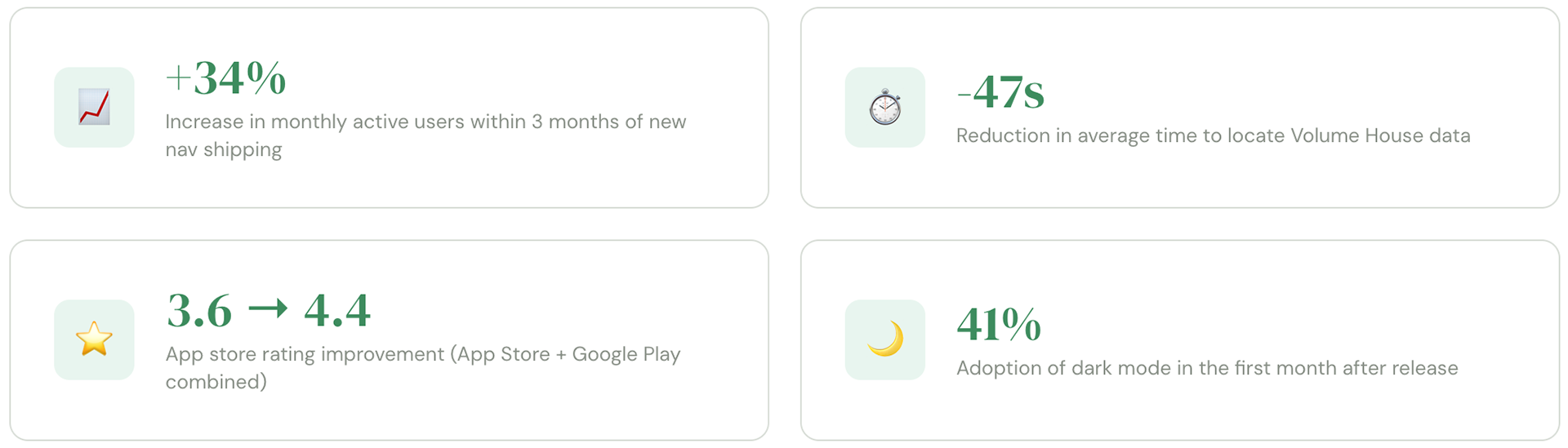
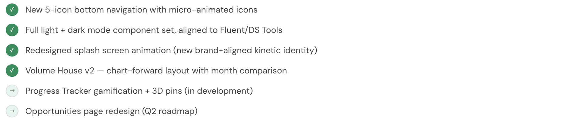
What shipped
Reflection
What I learned
What I learned